
Drop Bear Beer Labels
Drop Bear Beer Labels
Flat color Style • packaging
Client: Drop Bear Brewery
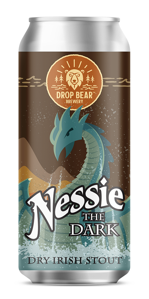
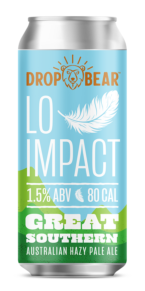
Although the initial design of their beer labels was tasteful and appealing, it was a little understated, which can be a liability when competing for attention in the beer cooler. The couple who owns the brewery— and brews all of the beers— has a very unique personality, and they wanted their labels to not only reflect that personality, but also to communicate more to potential customers about the unique personality of each beer. The original label design used a flat color approach, so I wanted to preserve that feeling, while at the same time breathe a little more color and vibrancy into the design.